Eco-friendly Personal Portfolio (2025)

Project in a few words
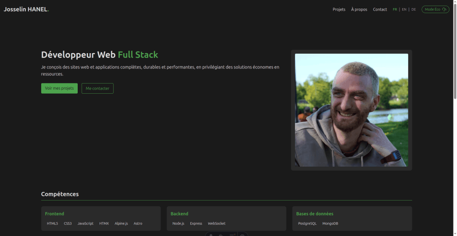
My personal portfolio designed as a technical demonstration of web eco-design. Features an "eco mode" that shows how to adapt a site for different usage contexts.
Project highlights
- Practical case study : Concrete demonstration of eco-design principles
- Functional eco mode : Alternative version optimized for slow connections and limited devices
- Differentiated approach : Two experiences based on needs and constraints
- Transferable model : Method applicable to informational and service sites
The goal was to create a concrete example of eco-design and prove the value of an alternative mode.
Technologies used
Astro TailwindCSS TypeScript
Have a project in mind?
Feel free to contact me for a free quote with no obligation.
Contact me
+33 7 81 33 97 68